Subway tiles are a timeless choice for kitchen design, blending effortlessly with styles ranging from traditional to modern. Selecting the best color, such as classic white for versatility or bold black for contrast, not only enhances the overall aesthetic but also shapes the mood and atmosphere of the space, helping to create a kitchen that reflects your personality and feels inviting.
This guide explores the best subway tile colors tailored to different kitchen styles, providing practical insights to help you achieve your design goals. From understanding color psychology to creating focal points, you’ll discover tips for designing a cohesive and visually appealing kitchen.

Understanding Your Kitchen's Style
Selecting the right subway tile color begins with understanding your kitchen's unique character. By aligning your choice with its style—whether traditional or minimalist—you can create a balanced and polished design.
Traditional Kitchens
Traditional kitchens radiate warmth and familiarity, blending classic design elements into a cohesive whole. Subway tiles can enhance this aesthetic by adding depth and texture while complementing key features. Here’s how specific colors can refine the timeless appeal of a traditional kitchen:
Brown Subway Tiles
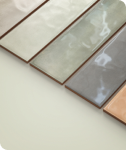
Brown subway tiles infuse warmth and depth, complementing traditional elements like carved wood cabinetry or ornate stone countertops. Their earthy tones can be used to emphasize natural grains or patterns, creating a layered look that feels organic yet refined. Edward Martin’s Leona 3x12 Polished Porcelain Tile in Amani Bronze (depicted in the image above), for instance, adds a touch of elegance with its subtle sheen, blending practicality with sophistication.
Soft Blue Subway Tiles
Soft blue subway tiles bring a delicate contrast to the warm tones commonly found in traditional kitchens. Their cool hues soften the visual weight of darker wood finishes, creating a balanced and airy feel. For example, soft blue subway tiles can act as a soothing backdrop for decorative elements like brass fixtures or glass-paneled cabinets, enriching the overall design without overpowering it.
Beige Subway Tiles
Beige subway tiles offer a seamless connection between the kitchen’s varied textures, such as veined granite countertops and detailed cabinet paneling. Their neutral warmth can tone down busier patterns, providing a clean yet rich foundation. Arranging beige subway tiles in a herringbone or stacked layout also introduces subtle texture, enhancing the space’s visual appeal while maintaining its timeless quality.
Cream Subway Tiles
Cream subway tiles brighten traditional kitchens while preserving their warm and inviting character. This color works particularly well in enhancing lighter wood tones, like maple, or to offset the darker hues of countertops. Cream subway tiles also highlight small design details, such as beveled edges or decorative backsplash niches, ensuring every element of the kitchen feels intentional and cohesive.
Modern Kitchens
Modern kitchens embrace innovation with bold subway tile choices that add contrast and character. Options like glossy black or vibrant terracotta create striking focal points, blending practicality with creativity. These designs balance clean lines with unique elements for a dynamic, functional space.
Black Subway Tiles
Black subway tiles add a striking edge to modern designs, creating contrast and enhancing depth. Their glossy surface reflects light, balancing darker tones while complementing lighter countertops or metallic accents. Subtle textures or patterns can also introduce visual interest without disrupting the clean, modern look.
Dark Grey Subway Tiles
Dark grey subway tiles offer a refined alternative to black, maintaining a contemporary feel while softening the contrast. Their versatility makes them an ideal choice for pairing with elements like polished concrete, matte finishes, or warm wood accents, creating a balanced and cohesive design.
Orange Subway Tiles
Orange subway tiles bring energy and vibrancy to modern spaces, serving as a bold focal point. Muted shades, like terracotta, pair well with neutral cabinetry or stainless steel details, providing warmth without overpowering the design. This choice works particularly well in open layouts, adding personality while maintaining harmony.
Minimalist Kitchens
Minimalist kitchens focus on calm and simplicity, using subway tiles in muted tones like soft grey or sage green to enhance the serene atmosphere. With subtle textures and layouts, these elements create a harmonious blend of function and tranquility.
White Subway Tiles
White subway tiles define minimalism, offering a clean, expansive look that reflects light and brightens the space. A matte finish can add softness, while patterns like vertical stacking or staggered placement introduce visual interest without breaking the simplicity. These tiles work seamlessly to frame key areas, such as the sink or stove, while keeping the design cohesive.
Light Grey Subway Tiles
Light grey subway tiles bring gentle contrast and a sense of balance to minimalist kitchens. Their subdued tone softens the starkness of white and pairs effortlessly with metallic or natural accents. Positioned as a backdrop for open shelving or appliances, they subtly elevate the design while maintaining its streamlined appeal.
Green Subway Tiles
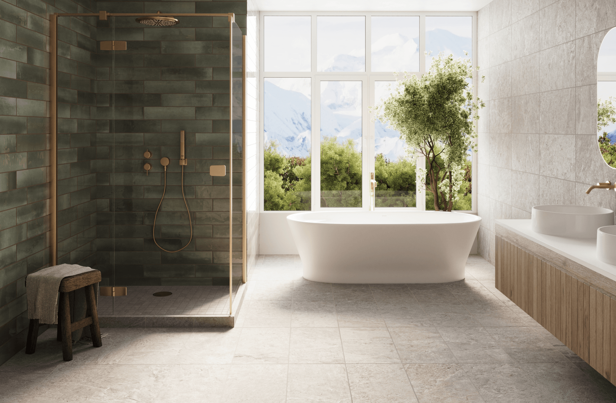
Sage or olive green subway tiles introduce an organic element, enriching the space with natural tones. A backsplash in these muted tones can create a calming focal point, complementing neutral cabinetry or connecting indoor spaces to outdoor elements for a harmonious feel.
To choose the best color for your kitchen, try Edward Martin’s augmented reality (AR) tool. This feature lets you preview how different subway tile colors and finishes will look in your space, helping you make an informed decision. By experimenting with options, you can see how they enhance your kitchen's style and ensure your choice aligns with your vision.

Color Psychology in Kitchen Design
Colors significantly influence the mood and functionality of a kitchen, shaping how the space feels and interacts with its users. Thoughtful color choices can go beyond aesthetics to enhance the atmosphere, whether creating a calming retreat or a lively hub for socializing.
The Science Behind the Palette
Color psychology ties our perceptions of color to emotional responses. Warm tones like red and orange exude energy and vibrancy, making them ideal for spaces meant to feel lively, such as breakfast areas. Conversely, cool tones like blue and green evoke calmness and serenity, making them perfect for kitchens where relaxation is key. Neutrals like white and grey, on the other hand, provide balance and flexibility, offering a clean, open look that complements various styles.
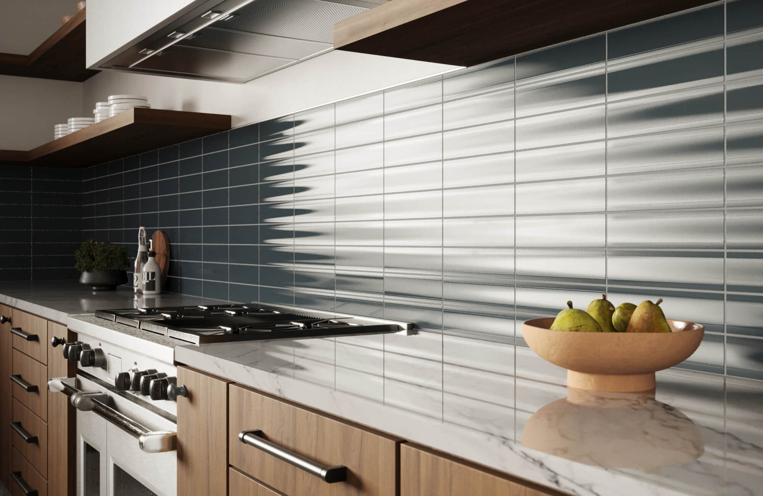
Darker shades, such as black, convey sophistication and depth. For instance, the Jaden 2.5x16 Glossy Ceramic Tile in Ink, as displayed in the photo above, exemplifies this with its reflective surface, which adds dimension while retaining elegance. Paired with lighter elements or metallic finishes, it creates a bold yet harmonious contrast, illustrating how intentional color selection shapes both mood and visual impact.
Using Colors for Spatial Dynamics
Colors influence not only the mood but also the perception and function of a kitchen. For instance, light tones like white or soft grey open up smaller spaces, making them feel brighter and more expansive. In larger kitchens, darker shades like navy or charcoal add depth and create a sense of coziness without overwhelming the design. Introducing bold accents, such as terracotta or emerald green, can highlight features like backsplashes or islands, adding visual interest. A thoughtful balance of light, dark, and accent tones ensures a kitchen that feels cohesive, functional, and visually engaging.
Considering Personal and Practical Preferences
While general color psychology provides guidance, personal associations with colors often take precedence, making individual preferences essential to the final choice. For instance, a color that energizes one person may overwhelm another.
To make an informed choice, you can test tile samples in small areas to determine how a shade aligns with your preferences and meets functional needs. In busy spaces, darker tones can be particularly practical, as they help conceal stains and wear. Additionally, evaluating colors under both natural and artificial lighting ensures they interact harmoniously with your space throughout the day, creating a balanced and intentional design.

Creating a Focal Point
Incorporating a focal point is a simple yet impactful way to elevate your kitchen’s design. A thoughtfully chosen accent draws the eye, adds depth, and enhances the overall ambiance of the space. Subway tiles, with their versatile designs and finishes, provide numerous options for creating striking focal points.
Accent Walls as a Bold Statement
An accent wall can transform your kitchen by creating a focal point that enhances the overall design. Bold colors or unique tile patterns draw attention and add depth, while muted tones provide a calm yet dynamic backdrop that complements other design elements. Rich hues like navy blue, emerald green, or charcoal grey pair well with lighter cabinetry or neutral countertops for a balanced contrast. For a softer approach, muted tones offer a calm yet dynamic backdrop, subtly complementing the kitchen’s design while allowing other details to shine.
The image above highlights the Julianna 4x12 Glossy Ceramic Tile in Carrara, used as an accent wall behind brass shelving. The subway tile’s soft veining and polished finish provide a sophisticated yet understated backdrop, allowing the brass decor to stand out while maintaining a cohesive, elegant design.
Backsplashes for Big Impact in Small Spaces
Backsplashes in small kitchens provide an excellent opportunity to elevate its overall design. A herringbone pattern in a bold color, such as navy or emerald, can draw attention without overwhelming the space, creating a striking focal point that pairs seamlessly with light-toned countertops. For a softer look, textured white subway tiles with subtle veining add a refined touch, providing an elegant yet understated backdrop for metallic fixtures or open shelving. Soft grey subway tiles with contrasting grout also offer a polished and defined appearance, complementing neutral cabinetry and stainless steel appliances. To create the illusion of height in compact kitchens, vertically arranged light green subway tiles can make the space feel more expansive and airy.
Kitchen Islands as a Standalone Statement
Kitchen islands naturally serve as focal points, making them an ideal feature for creative and bold tile applications. Deep blue subway tiles on the island base can introduce a striking contrast, especially when paired with white or marble countertops and coordinated lighting fixtures. For a more understated yet distinctive effect, wrapping the island in two complementary tones—such as beige on one side and white on the other—adds subtle depth and visual interest. Warm terracotta tones can also enhance the island’s character, working harmoniously with natural wood cabinetry and brass accents for a modern rustic appeal. Alternatively, incorporating a mosaic-inspired arrangement of muted greens and greys creates texture and depth, turning the island into an eye-catching centerpiece.
Maintenance Tips
While subway tiles are admired for their aesthetic appeal, durability and ease of maintenance are essential factors to consider. Ceramic and porcelain subway tiles stand out for their resistance to moisture and stains due to their non-porous surfaces. Porcelain, in particular, offers exceptional density and durability, making it ideal for busy kitchens. Its strength minimizes the risk of chipping, while glazed options, like those from Edward Martin, feature a protective finish that resists scratches, ensuring a low-maintenance and reliable solution for busy households.
Regular cleaning also helps preserve the appearance and longevity of your subway tiles. Using warm water and mild dish soap with a soft cloth or sponge prevents scratches and removes residue. Avoid harsh chemicals or abrasive cleaners as well, since they can damage the tile surface and weaken the grout. A quick wipe-down after cooking prevents build-up and keeps the tiles looking fresh.
Grout care is equally important to maintain the overall look of your backsplash or accent wall. Specialized cleaners can restore discolored grout, while applying a high-quality penetrating sealer protects it from stains and makes future cleaning easier. By combining proper tile and grout maintenance with adherence to the manufacturer’s recommendations, you can ensure your subway tiles stay both visually appealing and highly functional for years to come.
Subway Tile Colors that Reflect Your Style
Selecting the right subway tile color can define your kitchen’s style and atmosphere. By considering your kitchen’s design, the psychological impact of colors, and the functionality of each area, you can achieve a cohesive and practical space. For example, white subway tiles offer a clean, versatile foundation, while soft grey adds a refined touch. Bold options like deep navy or black create striking contrasts, and natural greens bring a sense of calm. Warm tones like orange also add energy and vibrancy, making them ideal for lively spaces.
For an even closer look, Edward Martin offers high-quality 4" x 4" samples that accurately reflect the color and finish of all tile sizes in each collection. These samples allow you to experience the true quality and texture of our products, making it easier to choose the perfect subway tile for your project. Exploring a sample can be a helpful first step toward bringing your design vision to life.


