


Subway tiles may be a timeless feature, but the direction in which you lay them can redefine how your kitchen feels and functions. Whether you want to open up the room, add architectural interest, or align with cabinetry lines, your tile layout quietly influences every visual element in the space.
As you explore vertical and horizontal arrangements, you’ll find that each choice offers its own design rhythm, installation strategy, and stylistic impact. This article walks you through the key factors that shape the decision so you can confidently choose the layout that brings out the best in your kitchen.

Assessing Visual Space in Your Kitchen
Tile orientation defines perception. The way subway tiles are laid can make a kitchen feel wider, taller, cozier, or more expansive. This section dives into the visual influence of horizontal and vertical patterns and how they can reshape the sense of space in your kitchen.
Horizontal Expansion in Elongated Kitchens
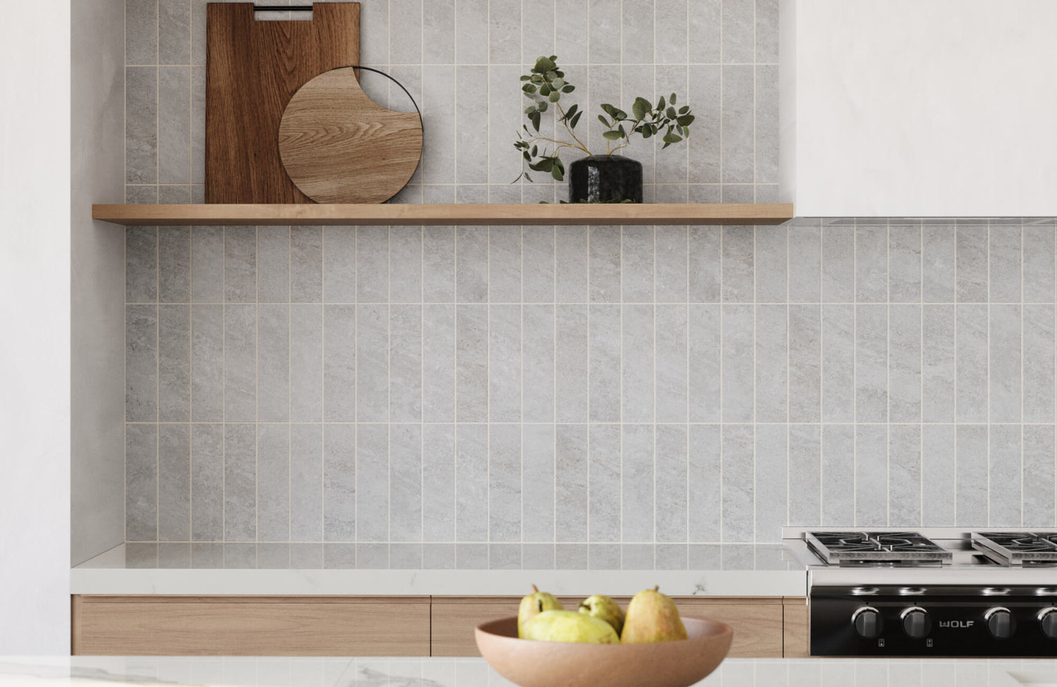
If your kitchen feels narrow or stretched in one direction, a horizontal subway tile layout can reshape the way the space is perceived. By laying subway tiles with their long edge parallel to the floor, you naturally draw the eye from side to side. This continuous movement also creates a sense of width that can counterbalance a room that might otherwise feel tight or boxed in. In galley kitchens or kitchens designed along a single wall, this horizontal flow introduces a grounded, composed rhythm that helps the entire space feel more unified.
This approach becomes especially effective when it works in harmony with the kitchen’s architectural lines. As seen in the image above, the horizontal backsplash reinforces the clean lines of the countertops and wood cabinetry, visually stretching the space. Our Harley 3x12 Polished Porcelain Tile in Greige, used on the wall, introduces a soft gray-beige tone that brings both warmth and subtle texture. Its polished surface also gently reflects light, adding depth and refinement without disrupting the room’s calm, modern atmosphere. With subway tile lines that flow seamlessly from end to end, this layout brings balance, elegance, and a greater sense of spaciousness to even the most compact kitchens.
Verticality to Enhance Ceiling Height
When your kitchen feels visually compressed, a vertical subway tile layout can instantly shift the room’s energy. Instead of drawing the eye across the walls, this orientation encourages upward movement, pulling attention toward the ceiling, which results in a subtle but effective sense of added height that changes how the space feels, especially in kitchens with low ceilings or minimal natural light. By simply changing the direction of your subway tile, you create a visual lift that makes the room feel airier and less confined.
This approach is impactful when there’s unused space between the tops of your cabinets and the ceiling. Vertical subway tiles help bridge that gap, guiding the eye past cabinetry and softening the visual cutoff. Even in compact kitchens, this directional trick brings structure and sophistication, helping the walls feel taller without adding clutter. It’s also a smart design move that delivers noticeable change through layout alone, proving that sometimes, it’s not about how much space you have, but how you visually shape it.
If you’re unsure how this layout or even the horizontal one will translate in your own space, our augmented reality (AR) tool lets you preview subway tile designs directly on your kitchen walls before you commit. This way, you can visualize the layouts in real time and make confident choices.

Matching Layout to Cabinet and Appliance Lines
Your kitchen’s hard surfaces, such as cabinets, counters, and appliances, form strong visual anchors. Subway tile orientation should complement these lines for a cohesive design. Below, we’ll unpack how alignment with built-in features can enhance or disrupt your kitchen's harmony.
Aligning Horizontally for Seamless Countertop Transitions
When you lay subway tiles horizontally, you reinforce the natural visual rhythm already present in most kitchens. Countertops, open shelves, and upper cabinets typically run in straight horizontal lines, so mirroring that with your subway tile creates a seamless visual flow. Rather than drawing attention to the backsplash as a standalone feature, this orientation allows it to blend into the larger framework of the space. It also feels cohesive and measured, helping the eye move effortlessly from one surface to the next without interruption.
This alignment reduces the risk of visual clutter as well, especially in kitchens with long countertops or full-wall cabinetry. Each grout line also becomes part of a broader pattern, falling into harmony with the room’s structural geometry. When everything lines up, the space feels calmer and more intentional. Whether your style is minimalist or classic, this layout makes your backsplash feel like an integrated part of the architecture rather than a decorative afterthought.
Vertical Patterns Beside Tall Elements
When your kitchen includes bold vertical features like a full-height refrigerator, pantry column, or a vent hood that stretches to the ceiling, laying subway tiles vertically can enhance these elements rather than compete with them. The upward orientation also naturally echoes the structure of tall features, creating a visual rhythm that feels intentional and well-balanced. Instead of letting these items stand apart or feel overly imposing, vertical subway tile lines help pull them into the larger design, making the space feel unified rather than segmented.
A great example of this approach is the kitchen photo shown above, where vertically stacked subway tiles complement the surrounding full-height wood cabinetry and curved island. Our Mikayla 2.5x5 Glossy Ceramic Tile in Olive adds soft green hues and a subtle sheen that brings both dimension and warmth to the space. Its compact format and vertical layout also introduce a calming sense of height while anchoring the tall elements around it. With thoughtful placement, the vertical direction elevates the room’s architecture and maintains a polished and balanced aesthetic.

Supporting Style Identity in the Kitchen
Tile orientation shapes the personality of your space. The way subway tiles are laid can reinforce a clear design narrative, subtly complementing or boldly contrasting your kitchen’s style.
Horizontal for Classic or Retro Interiors
Choosing a horizontal subway tile layout brings instant familiarity and comfort to your kitchen. This traditional arrangement, especially when laid in an offset or running bond pattern, reflects the timeless charm of early 20th-century spaces. Also, it naturally evokes a sense of continuity and warmth, which is why it remains a favorite in classic and transitional kitchens. When paired with soft hues, wood cabinetry, or vintage-inspired fixtures, the horizontal subway tile layout helps build a cohesive environment that feels both enduring and inviting.
A marble look subway tile, in particular, offers this subtle blend of old-world charm and modern refinement, perfect for kitchens that embrace classic elegance. The kitchen space shown in the picture above captures that spirit with its arched wood doors, soft neutral palette, and balanced symmetry. Featured on the backsplash is our Aniston 3x12 Polished Porcelain Tile in Calacatta Quarzite, a white porcelain tile with striking gray veining that mirrors the look of traditional Calacatta marble. Its polished finish and horizontal layout introduce a refined visual rhythm that elevates the kitchen’s classic aesthetic and maintains a clean, timeless feel.
Additionally, this layout is appealing because it effortlessly blends into a nostalgic or rustic setting. The horizontal lines echo the natural alignment of shelves and countertops, reinforcing the kitchen’s structure without demanding attention. There’s also a quiet elegance in the way this layout supports the rhythm of the room—it feels settled and balanced. If you lean toward a design that’s rooted in tradition yet still adaptable to subtle modern touches, the horizontal subway tile layout offers the perfect stylistic foundation. Rather than overpowering the room, it frames your kitchen with a classic charm that feels both familiar and timeless.
Vertical for Contemporary and Eclectic Designs
A vertical subway tile layout can instantly give your kitchen a sense of modern refinement. Unlike its more traditional horizontal counterpart, this arrangement introduces upward movement that immediately changes the room’s dynamic. By directing the eye from countertop to ceiling, vertical subway tiles offer a fresh, architectural quality that works especially well in kitchens where you want to emphasize height or openness. If you prefer a sleek, edited aesthetic, one that feels curated but never cluttered, this layout also fits naturally into that vision. It supports styles that favor clean geometry and quiet drama, including Japandi, industrial, and modern eclectic designs.
Moreover, this subway tile layout stands out for its ability to function as both a subtle accent and a defining feature. The vertical lines provide structure without overpowering the space, letting you highlight a backsplash, wall segment, or even a full-height surface with purpose. In kitchens where you’re working with flat-front cabinetry, concrete finishes, or neutral palettes, vertical subway tiles bring in texture and rhythm without breaking the minimalist intent. Their streamlined orientation also creates contrast against horizontal elements like counters or open shelves and reinforces a calm, grounded aesthetic.

Considering Backsplash Height and Wall Coverage
The height and extent of your backsplash influence how subway tile orientation reads in a space. Whether you opt for a standard height or go all the way to the ceiling, the direction in which your tiles are laid will impact the proportions and flow of your kitchen.
Full-Wall Installations and Vertical Impact
When you extend subway tile from the countertop to the ceiling, a vertical layout can completely reshape how your kitchen feels. Rather than stopping midway up the wall, letting the tile climb to the top naturally leads the eye upward. This creates a strong sense of verticality, making the room feel taller and more expansive without altering its actual dimensions. It’s especially effective behind a range hood, along a feature wall, or in open-concept kitchens where visual continuity helps define zones without relying on contrasting finishes or bold accent walls.
A perfect example of this effect is shown in the image above, where our Natasha 2x6 Matte Porcelain Tile in Denim adds depth and drama with its rich navy-blue color and vertically stacked layout. The matte finish softens the bold tone just enough, allowing the subway tile to serve as both a refined backdrop and a strong architectural statement. Each upright row also introduces a gentle rhythm that feels intentional and sculpted, enhancing the verticality of the space without overwhelming it. This approach is effective in kitchens with taller ceilings, where vertical subway tiles transform the wall into a tailored, expressive feature that feels timeless and elevated.
Standard Backsplashes and Horizontal Flow
When your backsplash is confined to a standard height typically ending around 18 inches above the countertop, a horizontal subway tile layout offers a practical and visually pleasing solution. The direction of the tiles aligns effortlessly with the lines of your countertops and upper cabinets, reinforcing the natural horizontal flow already present in your kitchen. This alignment creates a visual connection between major elements, which not only enhances the structure of the space but also prevents the walls from feeling cluttered or disjointed. Even in kitchens filled with decorative features, this linear rhythm helps maintain order and balance.
Additionally, horizontal subway tiles are ideal if you’re after a backdrop that complements rather than competes. They span the wall in a quiet, composed way, allowing the backsplash to function as a subtle connector rather than a focal point. This makes the overall kitchen feel more grounded and cohesive, especially when you're working with limited space or aiming for a clean, traditional aesthetic. Instead of drawing attention upward or breaking the visual plane, the horizontal orientation supports a more classic ambiance, one that prioritizes ease, symmetry, and enduring style over trend-driven statements.

Planning Layout Based on Subway Tile Size and Edge Finish
Subway tiles come in a wide range of shapes, sizes, and edge treatments, and each of these factors affects how a vertical or horizontal layout will ultimately look. To make the most of your design, it’s important to consider how these physical details influence both visual flow and practical execution.
Rectangular Tiles and Optimal Line Direction
The size of your subway tile directly shapes the visual energy of the space. When you use elongated tiles like 3x12, 4x12, or even 4x16, the orientation you choose becomes far more noticeable. Laying these tiles horizontally creates a calm, continuous line that stretches across the wall, offering a sense of balance and composure. It also naturally mimics the length of countertops and cabinetry, reinforcing a horizontal flow that feels grounded and intentional. If your kitchen feels narrow or hemmed in, this layout can subtly stretch the space without overwhelming it with visual movement.
However, flipping those same subway tiles upright introduces an entirely different dynamic. Instead of anchoring the gaze across the room, a vertical layout sends it upward, inviting attention to climb the walls and explore the space above eye level. In the kitchen photo shown above, our Olivia 4x16 Glossy Ceramic Tile in Dove demonstrates this beautifully with its soft gray tone and reflective finish. The elongated format acts like a series of vertical columns, visually lifting the wall and adding a sense of spaciousness without any structural changes. Its glossy surface also catches natural light, enhancing the tile’s vertical rhythm and lending subtle sophistication to the neutral palette. In spaces with minimal upper cabinetry or open shelving, this vertical layout not only enhances visual height but also adds depth and sculptural elegance to the room.
Beveled or Framed Tiles and Layout Limitations
Edge finishes like bevels or framed borders add character and dimension to subway tiles, making each piece stand out with subtle shadows and texture. These design details create a sculpted effect that’s particularly eye-catching in horizontal layouts, where the play of light moves naturally across the length of the tile. Because the eye follows the horizontal flow, the raised edges appear consistent and intentional, reinforcing a clean, layered look that’s both timeless and easy to appreciate.
However, when you switch to a vertical layout, those same design features can behave quite differently. Overhead or directional lighting may catch the edges at awkward angles, causing uneven reflections or deeper shadows that exaggerate the bevels. What once looked crisp and refined might now seem overly bold or even distorted, especially if the wall surface isn’t perfectly even. In some cases, the repetition of vertical beveled edges can also create a “stacked” or cluttered appearance, which may compete with other elements in your kitchen.

Installation Effort and Maintenance Considerations
Beyond design, practicality matters. Some layouts are easier to install or maintain than others. Here’s how vertical and horizontal subway tile arrangements differ when it comes to execution and upkeep.
Horizontal Layouts
If you're aiming for a smoother installation process, a horizontal layout offers both practicality and efficiency. Most kitchens already feature prominent horizontal elements such as countertops and cabinetry, so subway tiles naturally align with these lines. This built-in visual guide also allows you to begin tiling along a straight, level surface without having to create new reference points. As a result, the initial setup becomes faster, and it’s easier to maintain consistent spacing and alignment across the entire wall.
Furthermore, horizontal subway tile layouts tend to be more forgiving when it comes to slight imperfections. If your walls aren’t perfectly plumb or flat, those small inconsistencies won’t be as obvious with horizontal rows. The eye typically follows the direction of the tile lines, and when those lines stretch across the wall rather than climbing up it, any variation blends more easily into the background. That visual softness also makes installation less stressful and can reduce the need for intensive prep work, which may help lower labor costs.
Vertical Layouts
A vertical layout brings undeniable height and elegance to a kitchen, but that bold visual statement demands extra precision. Without the horizontal guideline of a countertop edge, aligning each subway tile becomes more complex. You’ll need to rely heavily on spacers and leveling tools to ensure the columns remain perfectly straight from top to bottom. Even the slightest shift can throw off the rhythm of the layout, especially when tiles run across large vertical spans like range walls or full-height backsplashes. That kind of visibility means there’s little room for error, and it often requires more time and attention during installation.
Once everything is set, the focus shifts to upkeep, and that’s where vertical grout lines can present new challenges. Since these lines naturally catch the eye, they tend to reveal stains, water spots, or uneven coloring more easily than horizontal ones. This is true if you opt for contrasting grout, which can accentuate the seams even further. Gravity also doesn’t work in your favor either. Dust and splatter can trickle downward along the grout lines, creating streaks that interrupt the clean, structured look. To keep the finish looking intentional and fresh, sealing the grout becomes essential, and routine cleaning becomes part of your long-term tile care. Although it may require a bit more effort, the reward is a layout that feels distinct, architectural, and well-composed.
Choosing the Right Layout
The choice between vertical and horizontal subway tile layouts isn’t just about looks. It’s about how you want your kitchen to function, feel, and flow. If you're drawn to classic charm, streamlined surfaces, or a space that feels wider and more settled, a horizontal layout may be your best fit. On the other hand, if you’re looking to introduce height, modern structure, or a more daring design edge, vertical subway tiles can transform your kitchen walls into a striking architectural backdrop. By understanding how orientation interacts with space, light, and style, you can make a layout choice that not only complements your kitchen but also elevates it.
If you're still unsure which layout will work best in your space, our design services can help bring your vision into sharper focus. Whether you're working with a cozy galley kitchen or an open-concept layout, our expert team can guide you through tile placement, scale, and style, making sure every detail supports the atmosphere you want to create.
