Checkerboard tiles bring timeless character and visual interest to any space, blending seamlessly with both classic and modern interiors. Their bold patterns and striking contrasts can transform a room, but choosing the right tile colors requires more than just personal preference. Room lighting plays a significant role in how these tiles appear throughout the day, influencing their overall look and atmosphere.
In this guide, we’ll show you how to choose the best checkerboard tile colors by understanding how natural and artificial light affect their appearance. You'll also discover practical tips for selecting shades that enhance your space, ensuring your tiles look cohesive and stylish in any lighting condition.

Natural Lighting
Natural light plays an important role in how checkerboard tile colors appear throughout the day. As the sun shifts, the angle and intensity of light can either brighten or soften the contrast between tiles, subtly altering the room's overall feel. This dynamic quality can enhance vibrant colors in the morning while creating a more muted, cozy atmosphere by evening, making it important to choose colors that adapt well to these changes.
High-contrast combinations, such as the Leona 12x12 Checkerboard Matte Porcelain Tile in Calacatta and Nero Marquina shown above, work well in rooms with lots of natural light because they reflect brightness while adding sharp definition. The crisp Calacatta white combined with the deep Nero Marquina black creates a timeless and elegant checkerboard effect that changes beautifully throughout the day. This striking contrast heightens the sense of openness while also giving the space a grounded, sophisticated feel that works well in naturally lit areas.

Artificial Lighting
Artificial lighting can have a significant impact on how checkerboard tile colors appear, with different bulb types casting distinct tones across the space. For instance, LED lights often offer crisp, cool illumination that highlights lighter tile shades, whereas incandescent bulbs produce a warmer glow that softens stark contrasts. Fluorescent lighting, on the other hand, can occasionally emit a slight green or blue tint, subtly altering how colors are perceived, making understanding the light source important for accurate tile selection.
For rooms that rely heavily on artificial light, neutral or warm-toned tiles, such as the Leona 12x12 Checkerboard Matte Porcelain Tile in Marfil and Amani Bronze shown above, can help create a cozy, balanced look. The combination of soft beige and warm brown works well with incandescent and ambient lighting, bringing out rich, earthy tones that feel inviting in artificial light. A great tip is to test tile samples in the room's lighting conditions to ensure that the colors are consistent and harmonious, preventing unexpected tone shifts throughout the day.

Mixed Lighting Scenarios
Mixed lighting introduces a blend of natural and artificial light, creating unique challenges for maintaining consistent tile color appearances. As daylight fades and artificial lighting takes over, tile colors can change their tone, appearing brighter or more subdued depending on the warmth or coolness of the light. This combination can either highlight or wash out checkerboard patterns, so it is important to choose colors that work well under both conditions.
Mid-tone colors such as taupe, beige, or cream work well in mixed lighting because they provide a consistent appearance without drastic changes. Pairing these with darker colors like charcoal or black can result in a grounded, balanced look that changes throughout the day. Our Leona 12x12 Checkerboard Matte Porcelain Tile in Marfil and Nero Marquina, shown in the image above, showcases this effect by combining soft beige with bold Nero Marquina black, ensuring the pattern remains striking yet harmonious across different lighting sources. In addition, layering overhead LEDs with warm table lamps can help smooth transitions and keep the space cohesive, even in mixed lighting.

Room Size and Tile Layout Impact
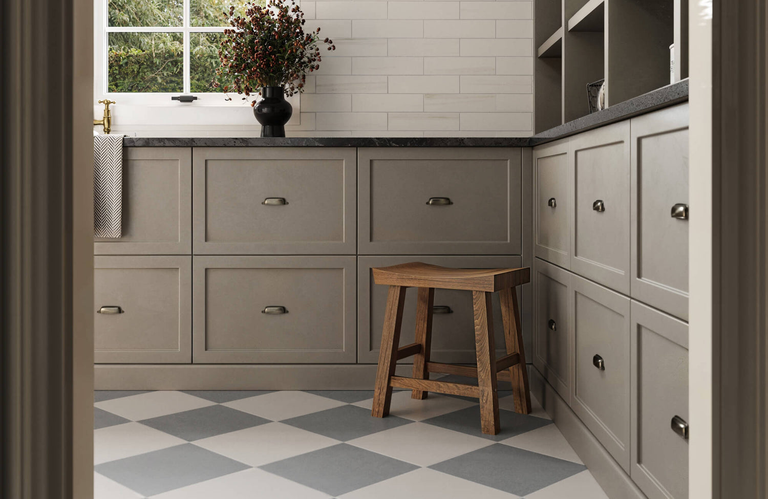
Room size and layout have a significant impact on how light interacts with checkerboard tile colors, influencing the overall perception of space. In larger rooms, light and soft grey tiles, as shown above with the Leona 24x24 Checkerboard Matte Porcelain Tile in Calacatta and Amani Grey, reflect natural light beautifully, enhancing the room's openness without overwhelming it. On the other hand, deeper tones such as charcoal or rich browns can add warmth and definition to smaller rooms, creating a sense of depth and preventing the space from feeling too sparse while maintaining a cozy and inviting atmosphere.
When choosing tile colors, consider not only the shade but also how strategic tile placement affects light distribution and spatial flow. In large, open spaces, placing darker tiles along the perimeter with lighter tiles in the center can help ground the room and prevent it from feeling too expansive. This approach draws the eye inward, creating a sense of balance and cohesion. For smaller areas, using darker tiles around the perimeter and lighter tiles in the center can create the illusion of a larger space.
Tile Finish and Decor Coordination Tips
When selecting checkerboard tile colors, it’s essential to think about how they also interact with the room’s existing decor and overall design. Soft, neutral tiles complement minimalist and modern interiors, while bold, high-contrast colors bring energy and character to vintage or eclectic spaces. To achieve a unified look, you can coordinate tile colors with surrounding elements such as wall paint, cabinetry, and furniture. This creates visual harmony and ensures the tiles enhance the room without clashing with other design features.
In addition to decors, the finish of your checkerboard tiles plays a key role in shaping your room’s atmosphere and spatial perception. Glossy finishes can reflect light effectively, brightening darker areas and adding a sense of openness—making them a great choice for compact rooms, bathrooms, or spaces with minimal natural light. By contrast, matte finishes can soften reflections and provide a subtle, refined aesthetic that works best in well-lit or expansive areas where excess brightness could be distracting. Considering both decor and finish can help you create a balanced, inviting environment that aligns with the room’s lighting and overall style.
If you want to see how the right checkerboard tile color can transform your space, use our augmented reality (AR) tool. It's a great way to test out different options and see how each tile layout affects your interior design before making a final decision.
Conclusion
Choosing the right checkerboard tile colors requires understanding how light affects their appearance throughout the day. Natural light brightens and enhances soft, neutral tones, whereas artificial light causes subtle shifts that can warm or cool their overall appearance. In spaces with mixed lighting, choosing adaptable, mid-tone colors helps maintain balance and keeps tiles from appearing too harsh or dull. By considering room size, tile layout, interior decor, and finishes, you can ensure the tiles reflect light beautifully and contribute to a cohesive, well-designed space.
If you are thinking about adding checkerboard tiles to your home, we have a variety of options to fit any style or lighting condition. Whether you lean toward bold, eye-catching patterns or softer, understated designs, our collection is designed to meet your needs. If you have any questions or need personalized advice, feel free to contact us! Our team is here to help you find the perfect checkerboard tiles to bring your design vision to life.


