


Selecting the right rug isn’t just about taste, it’s a strategic design decision that influences visual cohesion, spatial balance, and overall ambiance. From the start, factors like color theory, undertone compatibility, and contrast with flooring and upholstery all contribute to a polished, intentional look.
In addition to these design fundamentals, professionals also consider fiber reflectivity, lighting, and material finishes to ensure color depth throughout the day. Whether you’re curating a home or refining a commercial space, the right rug can tie your design together. In this blog, we’ll explore how to choose a rug color that aligns with your furniture using expert techniques and enduring strategies.

Understanding Color Theory Basics
Before selecting a rug color that truly works with your furniture, it helps to understand the core principles that guide how colors interact. From how hues relate on the color wheel to the impact of warmth, coolness, and intensity, these foundational concepts make every design choice more intentional.
The Color Wheel and Color Harmonies
The color wheel is a fundamental design tool that organizes hues in a circular format, showing the relationships between primary (red, blue, yellow), secondary (orange, green, purple), and tertiary colors (such as blue-green or red-violet). When choosing a rug, referencing the color wheel helps identify which tones naturally complement your furniture and décor. For example, complementary colors, those positioned directly across from each other on the wheel, like blue and orange, offer high contrast and energy. As a result, this pairing works well in modern, bold interiors where visual impact is desired.
On the other hand, for a more understated or cohesive look, designers often rely on analogous color schemes, which use hues that sit side-by-side on the wheel (such as yellow, yellow-green, and green). These combinations feel naturally harmonious and are ideal for serene or transitional spaces. Additionally, triadic color schemes, which draw from three equidistant points on the wheel (like red, yellow, and blue), can add balanced vibrancy without visual chaos, especially when one color is used as the dominant base and the others as accents. Ultimately, by understanding these harmonies, you can deliberately choose rug colors that either unify or dynamically contrast your existing furniture palette.
Color Temperature and Saturation
Beyond hue relationships, color temperature helps in setting the tone of a room. Warm colors like red, terracotta, and gold tend to advance visually, making a space feel cozy or intimate. For this reason, they’re often well-suited to larger rooms where a grounding rug helps define separate zones. Conversely, cool colors such as blue, gray, and sage tend to recede visually, which can make compact spaces feel more open and expansive. When coordinating a rug with your furniture, it’s crucial to align temperature for a cohesive effect; for example, pairing a warm-toned rug with warm-toned wood or upholstery helps maintain a consistent visual language throughout the room.
In addition to temperature, saturation, the intensity or purity of a color, also affects how dominant a rug appears within a space. Highly saturated rug colors bring boldness and contrast, making them ideal for rooms that need a focal point or a touch of dramatic flair. In contrast, desaturated tones such as muted olive, dusty rose, or soft beige offer more subtlety and tend to blend seamlessly with neutral or minimalist interiors.

Analyzing Your Furniture's Color Palette
Once you understand the basics of color theory, the next step is to take a closer look at the furniture you already have. By breaking down its colors and finishes, you’ll be better equipped to choose a rug that complements rather than competes with your space.
Identifying Dominant and Accent Colors
Every room has a visual hierarchy, and your furniture’s dominant color typically sets the baseline for how other elements, including rugs, should be coordinated. Typically, dominant colors are those that cover the largest surface area, such as the upholstery on a sectional sofa, the finish of a dining table, or the bulk of cabinetry in a built-in wall unit. These foundational tones often define the room’s character, whether it’s a neutral scheme centered around taupe or gray or a bold interior grounded by navy, emerald, or deep rust.
After establishing the dominant hue, it’s equally important to identify accent colors, those present in throw pillows, hardware finishes, artwork, or decorative trims. These secondary hues offer guidance when selecting a rug by opening opportunities for either color reinforcement or thoughtful contrast. For example, if your furniture includes brass accents, a rug with subtle gold undertones can tie the space together without overpowering the design. Likewise, if your main pieces are neutral, incorporating a standout accent color, such as burnt orange from wall art, into your rug pattern can introduce visual rhythm and a greater sense of cohesion.
To further refine your color decisions, professional designers often rely on tools such as color swatch comparisons or digital analyzers to match undertones with accuracy. By recognizing whether your furniture leans warm (with red or yellow undertones) or cool (with blue or green undertones), you can avoid subtle mismatches and ensure a harmonious alignment between your rug and the rest of the room.
Considering Furniture Patterns and Textures
Beyond color, the patterns and textures present in your furniture significantly affect how a rug will be perceived in context. When working with patterned furniture, such as floral upholstery, plaid armchairs, or geometric inlays, a more strategic approach is needed to prevent visual clutter. In these instances, it’s often best to select a rug with a simplified or tone-on-tone design, which helps maintain balance and allows the furniture to remain the visual focal point. In contrast, if your furniture is solid-colored or minimally patterned, you have greater freedom to introduce rugs with intricate motifs, such as Persian-inspired medallions or abstract modern designs, without overwhelming the space.
In addition to pattern, texture helps in both color perception and tactile balance. For example, a velvet sofa reflects light differently than a matte linen chair, subtly altering the perceived depth and richness of its color. Likewise, heavily grained wood furniture, like oak or walnut, introduces visual complexity that may benefit from being paired with a rug featuring a smoother surface or tighter weave for contrast. Alternatively, pairing sleek, contemporary furniture with a high-pile or hand-knotted rug can soften the look and add warmth and dimension to an otherwise minimalist arrangement.

Matching Rug Colors to Room Styles
Once you’ve analyzed your furniture palette, it’s just as important to consider the overall style of your room. Different design aesthetics call for different color strategies, and the right rug can help reinforce that visual identity with ease.
For Modern and Minimalist Styles
Modern and minimalist interiors are defined by clean lines, open space, and a restrained color palette. In keeping with these principles, rug colors should reinforce simplicity and structure while adding visual interest without contributing to clutter. Neutrals such as charcoal, ivory, stone, and soft gray are common staples, often chosen for their ability to ground the room without dominating it. Moreover, these hues pair seamlessly with architectural elements like polished concrete, exposed steel, and sleek tile flooring, materials frequently featured in modern homes.
To maintain tonal consistency, rugs in cool neutrals or monochromatic gradients help preserve spatial clarity and enhance light flow. In minimalist settings, low-pile or flatweave rugs in solid shades or subtle linear patterns are often preferred for their understated elegance and minimal visual disruption. When a pop of color is introduced, it’s typically a desaturated tone, such as muted indigo or olive, that serves as a deliberate design statement rather than a decorative afterthought. Pairing these with modular or mid-century-inspired furniture in matte finishes further reinforces the minimalist ethos.
For Traditional and Bohemian Styles
Traditional interiors emphasize symmetry, classic motifs, and layered richness, which opens the door for more saturated and historically rooted rug colors. In this context, deep jewel tones such as burgundy, navy, and forest green are frequently used in oriental, Persian, and medallion-style rugs, reflecting the heritage sensibility of the room. These rugs often feature intricate border work and central focal patterns, which coordinate well with carved wood furniture, antique finishes, and ornate metalwork, reinforcing a sense of timeless elegance.
By contrast, bohemian styles, while equally layered, embrace a more eclectic and expressive approach. In these environments, rug colors are typically vibrant, mixed, and globally inspired, featuring warm corals, turquoise, mustard, and magenta. Instead of matching a single dominant tone, bohemian rugs often draw from a broad color spectrum, making them ideal for spaces filled with varied furniture styles and collected décor from different eras and regions.
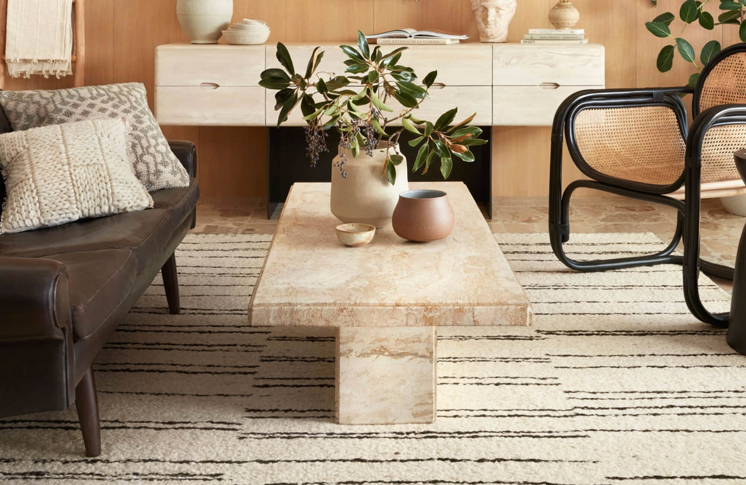
To prevent chaos in bohemian settings, designers often establish one anchoring color, such as a terracotta armchair or a teal ottoman, that the rug subtly echoes. This creates a visual rhythm between textiles, woods, and metal finishes. Additionally, layering rugs or choosing overdyed designs with faded vintage effects is a common strategy, blending color complexity with textural depth. A great example is Edward Martin’s Georgette Polyester Pile Rug in Navy / Rose, which incorporates timeworn florals and muted jewel tones into a refined palette that works well in both traditional and bohemian interiors. Featuring a balanced blend of blue, red, and weathered off-white tones, this rug, as seen in the photo above, offers a versatile foundation for spaces that embrace vintage warmth and global influence.

Considering the Room's Size and Lighting
Beyond color theory and style, the size of your room and the way it’s lit can dramatically influence how a rug looks and feels in the space. These factors shape everything from how open the room appears to how accurately the rug’s color reads throughout the day.
Using Light and Dark Rug Colors for Room Size
Rug color helps in manipulating how large or compact a space appears. Generally speaking, light-colored rugs, such as ivory, sand, or soft gray, tend to reflect more light, creating the illusion of openness and airiness. These tones are especially effective in smaller rooms, where visual expansion is desirable. When paired with pale or neutral tile flooring, light rugs help reduce visual boundaries, making a confined area feel more spacious and breathable.
On the other hand, dark-colored rugs, such as espresso, navy, or charcoal, absorb more light, which can visually condense a room. While this might seem limiting at first, it’s often a deliberate design strategy used in larger or under-furnished spaces. Dark rugs help ground the furniture, add visual depth, and create a sense of intimacy in expansive living rooms or open-plan layouts. Additionally, they provide a strong contrast against lighter flooring materials, helping to emphasize furniture outlines and architectural features.
Even so, it’s important to balance the rug's color with the rest of the room’s palette to avoid visual heaviness or imbalance. In compact spaces with low ceilings, dark rugs may feel too heavy unless offset by lighter walls or reflective surfaces that help bounce light. Conversely, in a large space dominated by light finishes, a darker rug can serve as an effective anchor, especially when it features subtle gradients or patterns that soften its visual presence. Edward Martin’s Davies Wool & Nylon Rug in Ash / Sand is an excellent example, featuring a softly textured checkerboard design in neutral tones that adds dimension without overwhelming the room. With its blend of gray and light brown shades, as shown in the photo above, this rug maintains visual balance in open layouts and complements a wide range of tile finishes and wood tones.
How Natural and Artificial Light Affects Rug Colors
Lighting dramatically alters the perceived hue and undertone of any rug. In particular, natural daylight, which shifts from cool to warm throughout the day, can reveal subtle variances in rug color, especially in high-pile or multi-tonal designs. For example, a rug that appears soft gray in the morning light may take on a bluish cast at midday or a warm taupe glow by evening. Additionally, south-facing rooms receive consistent warm light, enhancing reds, yellows, and earth tones, while north-facing rooms tend to cool down colors, making blues and greens appear more vivid and grays slightly bluer.
Meanwhile, artificial lighting introduces another layer of complexity. Incandescent bulbs emit a warm, amber-toned light that intensifies warm-colored rugs but may dull the richness of cooler hues. By contrast, LED and fluorescent lighting vary widely in color temperature, from cool white (around 5000K) to warm white (2700K), each impacting rug pigments differently. For instance, a cool-white LED may cause a cream rug to appear stark or slightly gray, while a warm-white bulb can introduce a golden tint, altering how well the rug coordinates with furniture finishes and room accents.

Practical Tips for Rug Color Selection
Once you’ve narrowed down your color options, it’s time to test how they actually perform in your space. From lighting conditions to fabric finishes, a few practical steps can make all the difference in choosing a rug that looks just as good at home as it does in the showroom.
Using Swatches and Samples for Color Matching
Swatches and rug samples are critical tools for accurate color evaluation, especially when coordinating with existing furniture, tile flooring, or wall finishes. Unlike digital screens, which often distort hue and saturation, physical samples reveal the rug’s true color under your home’s specific lighting conditions. This becomes especially important in transitional spaces, such as living rooms with large windows or open floor plans, where natural and artificial lighting shift throughout the day.
When testing these samples, place them next to primary furniture items and directly on the floor to observe how the color interacts with surrounding materials. Be sure to examine undertones, whether warm, cool, or neutral, as even subtle mismatches (like a beige rug clashing with a cream sofa) can disrupt the room’s overall harmony. To improve accuracy, designers often rely on indirect daylight and soft white LED lighting (around 3000K) during evaluation to replicate balanced conditions and reduce color distortion.
In addition, it’s helpful to compare multiple samples side-by-side to identify the most cohesive option for your space. If you're considering patterned rugs, request a sample section that includes both dominant and accent colors so you can evaluate how those hues coordinate, or contrast, with nearby furniture details. This sampling process is particularly valuable when layering rugs over tile or hardwood surfaces, as it allows you to confirm not only color compatibility but also consistency in sheen and visual weight.
Considering Rug Material and Texture
Material composition and surface texture significantly impact how a rug’s color is perceived and how well it complements your furniture. Different fibers, such as wool, cotton, polypropylene, and viscose, reflect light in unique ways depending on their weave and finish, which in turn affects how the rug appears in varying lighting conditions. Equally important, texture helps in visual perception. High-pile rugs, shag designs, or looped weaves scatter light unevenly, creating dynamic shading effects that can subtly shift the appearance of color from different angles. By contrast, flatweave or low-pile rugs offer a more uniform visual surface, making them ideal for spaces where color precision and pattern clarity are essential, particularly in modern or transitional interiors.
When coordinating rugs with furniture, it’s also important to evaluate how the rug’s texture interacts with upholstery finishes. For instance, a coarse jute rug beneath a leather sofa introduces tactile contrast, while a smooth, hand-tufted wool rug placed next to a velvet chaise creates a cohesive and layered softness. In addition to aesthetic considerations, durability should be factored in, especially in busy areas, so be sure the rug’s fiber content and dye method (solution-dyed vs. surface-dyed) align with your maintenance needs and lifestyle.
A great example is Edward Martin’s Pascal Polyester Face Rug in Brick / Multi, which demonstrates how a low-pile, intricately patterned rug can preserve color clarity and depth even under variable lighting. Its dense construction and vivid surface-dyed palette provide both resilience and visual richness, making it a strong choice for transitional spaces where pattern definition and fiber performance are equally important, as shown in the photo above.

Integrating Rugs with Tiles
If your space features tile flooring, choosing a rug involves more than just matching colors; it’s about creating visual balance between soft and hard surfaces. Whether your tiles are subtle or bold, the right rug can tie the room together without disrupting its flow.
Coordinating Rugs with Neutral Tile Colors
Neutral tile flooring, such as beige, ivory, gray, or stone-inspired tones, is a staple in both residential and commercial interiors due to its versatility and timeless appeal. Because these tiles create a grounded foundation, they serve as ideal backdrops for rugs in a wide spectrum of colors. Depending on your design goals, the rug can act as either a subtle extension of the flooring or a contrasting element that adds visual emphasis and interest.
To create harmony, it’s helpful to echo the tile’s undertone within the rug. For instance, a warm taupe porcelain tile pairs best with rugs that include complementary earth tones like camel, rust, or terracotta. In more subdued environments, such as minimalist interiors, rugs in desaturated hues, like oat, driftwood, or stone, can reinforce the architectural calmness of neutral tile floors. Conversely, if you’re looking to introduce contrast, incorporating a saturated accent like navy, ochre, or emerald can provide a striking focal point without overwhelming the design.
Equally important is the consideration of finish reflectivity. Matte tiles absorb light in a way that aligns well with flatweave rugs, while polished tiles reflect light more dynamically and tend to pair better with low-pile rugs that offer similar reflectivity. A fitting example is Edward Martin’s Lafferty Wool Blend Rug in Natural, which pairs well with soft beige or wood-look tile flooring. Its understated tone and subtly woven texture, as shown in the photo above, enhance minimalist interiors by reinforcing a calm, tonal aesthetic without competing for attention, making it a natural choice for serene, tile-accented spaces.
Coordinating Rugs with Patterned Tile Colors
Patterned tiles, whether encaustic, Moroccan-inspired, geometric, or marble-look, require a more nuanced approach to rug selection. Because these tiles often serve as the visual centerpiece of a room, it’s essential to coordinate rug color and design in a way that supports, rather than competes with, the tile’s intricate detailing.
To begin, analyze the tile’s dominant colors and identify one or two key hues that can be echoed in the rug. When working with tiles that feature intricate, multi-color patterns, it's often best to choose a rug in a solid or tone-on-tone shade that picks up on a secondary or less dominant tile color. This creates a visual bridge between the two surfaces without doubling the complexity. For example, if your encaustic tile includes navy, beige, and forest green, selecting a beige rug with minimal texture or a soft border design can help maintain balance without distracting from the tile’s impact.
If you’re intentionally layering pattern on pattern, especially in eclectic or maximalist spaces, be sure to establish visual hierarchy by varying the scale of the motifs. Pairing small, detailed tile designs with a rug that features large-scale geometric forms or wide color bands prevents visual fatigue and introduces depth through contrast in scale, not just color. In addition, transparency of design is key: rugs with distressed or overdyed effects tend to soften their visual footprint, making them more compatible with bold tile patterns.
Bringing Rug Color Harmony at Home
Choosing a rug color that complements your furniture requires a layered understanding of color theory, spatial dynamics, and surface coordination. From the outset, evaluating undertones, saturation levels, and material interplay ensures that each decision contributes to a cohesive and visually engaging environment. In addition, by factoring in room size, pattern scale, and architectural context, you can strategically use rug color to unify your design narrative without compromising functionality or style.
As you move from planning to execution, it’s important to consider how each element, rug, tile, and furniture, interacts in real time under your home’s unique lighting and daily use. With our personalized design consultation service, this thoughtful integration becomes seamless, enhancing visual continuity and elevating the lived-in feel of your space. For expert insight and tailored recommendations, contact us at Edward Martin, we’re here to help you create a space that feels intentional, balanced, and beautifully complete.
